|
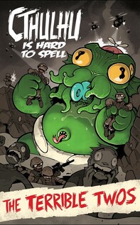
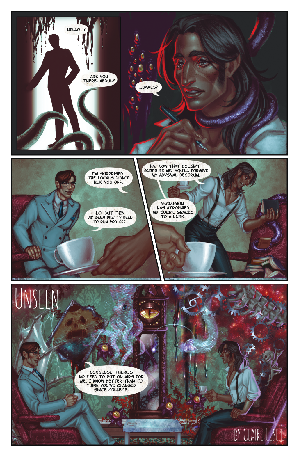
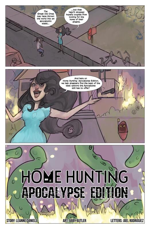
Art is forever expressing itself. Taking ideas and putting images to them, then reworking and tweaking them to become something else is one of the true ways that humans "play". In this way, some of the most beloved entertainment is born. From movies to art shows, runways to comics this collaborative effort spawns the chef-d'oeuvre of countless hours, editing, working and reworking a project to its perfection. If you are not familiar with the well known fantasy writer H.P. Lovecraft, you might find yourself intrigued by his weird and horrific imagery as well as his influence in the SciFi / Horror genres. It is here where the minds of writers and artists spring to collaborate on an Anthology of stories and art inspired by H.P. Lovecraft's imagination. Ctchulhu Is Hard to Spell: The Terrible Twos is the second book in the Anthology that has recently been completed. While there are many artists and writers that have contributed to this project, International Art Collective will be highlighting three of it's contributors. 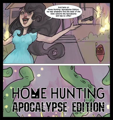 Abby Butler of ColorWIRED (an IAC veteran) has been stretching her legs as an artist by working with different mediums, perfecting her style, and exploring her interests through her art. In Cthulhu Is Hard To Spell, she collaborated with the talented Leanne Daniele for this post apocalyptic comic in which a mind could speculate that people still need a place to live during and after an apocalyptic event. "Home Hunting" explores how we would live along side monsters once the dust settles and Leanne Daniele's dark humor is at the forefront of this comic. You can check out her other projects here.
0 Comments
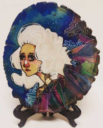
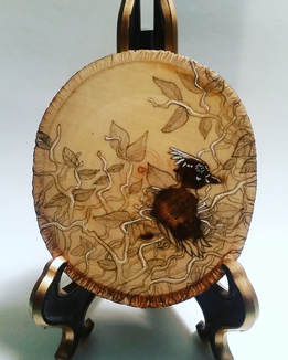
Albuquerque, NM The multi-talented Abby Butler is the artist behind colorWIRED, a collection of art focused on big ideas, drawn as focused vignettes. Her inspiration comes from music, gaming, science and even dialogue. Much of her art focuses on angelic faces of women and girls along with other elements of nature and space. Many of her pieces have an art nouveau feel to them with a dreamy modern twist as shown by her piece entitled: "Starships" (seen below). Her career as an artist started very young and she's expressed that growing up, she explored many forms of art including dance and tailoring. With the help of a friend in high school she became more serious about drawing and becoming a fine artist. In an effort to branch out, Abby has decided to perfect her skills in drawing flora and fauna. She says, "I think I'm going to learn to draw birds and flowers and hey! I really like drawing flowers, I think I might be in love with botany. I think I'm gonna study botany so I can know science and use that to draw nature better."
While being critiqued is it's own challenge, community thought and art for the masses presents another challenge. When asked how she might advise people in the community to better understand or engage with art, Abby plainly says that since everyone's experience with art is different, she can hardly advise anyone how to engage with it. Her suggestion is, "...to be open to ideas and concepts that you wouldn't otherwise look for. Don't prefer an art because it's hyper-realistic, prefer an art because you like it. Don't make cut offs simply because a label appears."
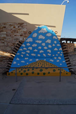
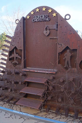
There is more on Abby and colorWIRED in our community showcase HERE. You can find Abby's art on her website www.colorwired.com as well as on social media (follow links) Facebook, Instagram, Twitter, ArtAmino and Diviantart. If you'd like to contact the artist or purchase a piece of colorWIRED, you can email colorWIRED at [email protected]. A few weeks ago, while perusing the Albuquerque Museum, the installation of a sculpture was emerging. The informational plaque hadn't been place yet, but I was drawn to the political and cultural statement that this piece so boldly proclaimed. The Chircahua Apache artist, Bob Haozous resides in Santa Fe, NM and has several thought provoking sculptures that have been seen all over the U.S. and the world.
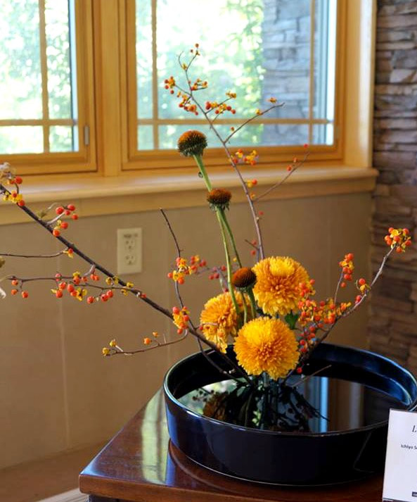
The event was held throughout the Botanical Gardens and had a very specific lay out. While there, I learned that there were different ability levels in the craft, and the first room of arrangements were those who were at the novice level. The floral arrangements ranged from large to miniature. Each used a unique pairing of flowers and colors that were purposefully placed in different vases and containers or trays that would sometimes stretch out upwards and sometimes horizontally.
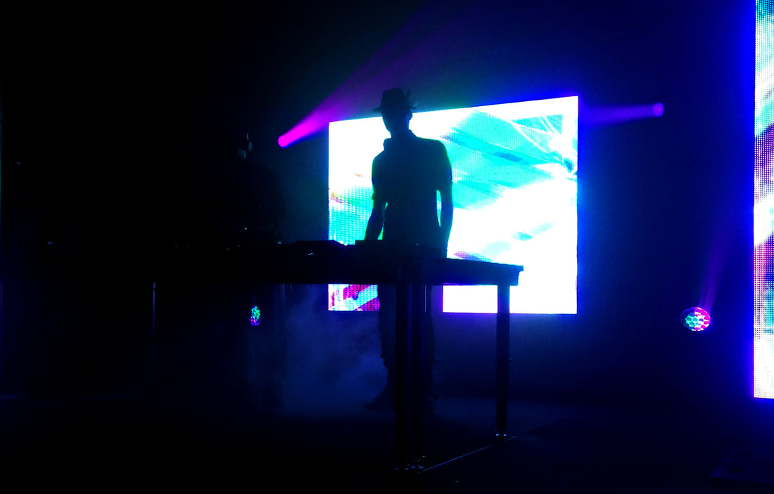
12.31.17DJ Booth : Sublunar The hottest art colony to hit Santa Fe held their 2nd Annual New Years Eve event on the Santa Fe School of Art & Design's campus. Called Sublunar, this rave-like dance party was everything a small, eclectic, southwest city could hope for on one of the most celebrated nights of the year. When walking into the space, there was an instant feeling of being on another planet. The futuristic feel along with the DJ booth spinning out electro beats made Sublunar a post-modern and surreal event.
Sublunar Installation art As we walked, or danced, around the room we saw every walk of life. Older people, younger people, every ethnicity and sexual orientation. The experience gave the masses a sense of community. A night when everyone could come together to celebrate, feel accepted and do it all among the ambience created by the Meow Wolf collaborative. It will be interesting to see what Meow Wolf will have up their sleeve for the future include NYE events. I can see this getting bigger, better and more spectacular in years to come.
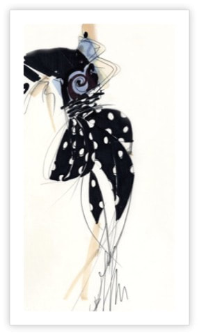
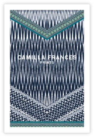
How does the artist, through fashion express their vision? What cultural themes can we explore to make sense of high fashion and make it relatable to us? How can fashion portray an entire social idea? THe designer's sketchFondazione Gianfranco Ferré 1988 In the late 1960’s Ferre received his Degree in Architecture from the Politecnico de Milano University in Italy. It was a time when Architects were not in high demand in the area and Ferre was able to find work designing accessories. He then was able to find work designing raincoats and eventually became a Stylistic Director for Christian Dior in Paris. In his design sketch, we can see his architectural background become evident in the design of the construction of this garment. If you look at similar sketches from the 1980’s, you’ll find that the design is much more realistic than artistic. For instance, he sketches the models body, very vague and almost non-existent yet to the observer, it is obvious that these lines and squiggles in a nude color are the model’s body parts, yet he doesn’t seem to care who this model is. He makes designs that appeal to the masses, making us, the consumer feel like we have individual style and flair. The model then, could be anyone and everyone. This brings up an interesting idea that the 1980’s was time of the rise of individualism. An idea that was moving away from the protesting, fight-for-your-rights idiom of the 1970’s. In his Essay, “How American Individualism is Evolving” Daniel Yankelovich describes this phenomena in this way, he says, “By the end of the 1970’s the majority of Americans had decided that self-expressiveness was too important for artists and writers to monopolize: everyone should have the opportunity to develop their inner potential for self-expression”. It is this very shift that makes Ferre’s sketch so relevant to the time that he sketched it. His use of polka-dots and the rosette, along with the large right shoulder piece and the draping of the skirt makes this design unique. For the fashionable woman, no other piece she owned would look like this, and can be interpreted to be couture, a design for an individual. An individual who could express themselves through fashion. Art Fashion on the RunwayAlexander McQueen 2013 Alexander McQueen was revered as a master theatrical designer. Many of his designs had a dark cynicism to them that splashed across a gown or was hidden in the details of an accessory, like a shoe. McQueen’s designs, show the duality of our inner and outer selves, the turmoil within ourselves that is ever in conflict a Yin and Yang Theme. Showcased as part of his 2013 collection for Fall/Winter, McQueen designed this high-heel shoe that explores this theme. His use of structure and foundation of the shoe through the metal work that seems spiked or pointed and the wispy, soft and fluttering feathers that dance as the shoe is worn as a model walks down the runway creates another feeling of “care-free-ness”. If we were to not look at this piece as article of fashion (which can be thought of as frivolous, expensive, or un-interesting to some) and look at it as a true piece of modern art, what would it tell us about the artist? What could this piece ignite within the observer to create sentiment? I would suggest that the clear pairing of soft and hard, dots and lines, metal and feather create an image of balance and masculine and feminine aspects of the Yin/Yang concept. Furthermore, McQueen’s personal life with riddled with hardship at times. He was an openly gay man whose relationship did not work out. The stress of designing for Givenchy as well as his own product line, as well as dealing with drugs and depression allow interesting interpretations of his work. Knowing a little bit about the background of the artist makes his art true to his self-expression. It might be easy to look at this piece and not connect to the artist because he seems far removed. His idea was brought to life by other people, the shoe, was worn not by him, but a model and we as the observers or consumers of his art see it on the runway or a magazine and never stop to think about Lee Alexander, who he was and why this particular design made it to the runway. It is easy, when consuming or observing fashion to lose the meaning behind a design because the design is for a practical use. The TextileCamilla Frances 2015 I wanted to explore for this last work, a textile design because so many cultural themes result in patterns used in fashion. Camilla Frances is a textile artist and designer for high fashion in London. Many of her designs are inspired by native peoples in Africa and beyond. The use of the geometric patterns and linear strokes in the textile example above really show how this inspiration is then executed.
What makes this design interesting is the fact that it is exotic. It’s bringing the idea of safari or travel to the people of high fashion. This idea of a tribal pattern isn’t new, it’s been used over and over again in many designs, and this is just one of the many examples of tribal textiles that could be featured here. The tribal textile is unique because the specific design can have a religious or cultural meaning. Theses designs are symbols for tribal people that may be religious or meaningful in other ways. Some critics would argue that taking these meaningful symbols and using them to sell product is wrong, and while that might be true, these patterns are usually an interpretation of the symbol to the artist and also a way to share these invented patterns with the world in a cultural way. I’ve included a photo of a runway garment made with one of Frances’ designs to explore and visualize the use of the textile in tribal inspired fashion. To the right you can see a gown by Valentino inspired by this natural, tribal print. The use of textile art in fashion is as integral to our cultural relevance as it is to fashion itself. Textile art is crucial to the designer’s vision and the use of visual culture. Cultural art is used to create this beautiful piece of fashion or “wearable art”. |
AuthorI have a vision of art and art education for the masses. Using a web based blog that is contributed to by the community we can view, comment and explore up and coming artists around the world. Archives
February 2018
Categories |

 RSS Feed
